Visual Weight: Collage Stamping
I'm introducing a new series. I thought we might go a bit deeper on some projects and look at why certain things work together to make a good design. You know I'm not big on "rules" when it comes to art...so these tutorials will be more focused on why certain elements appeal to us.
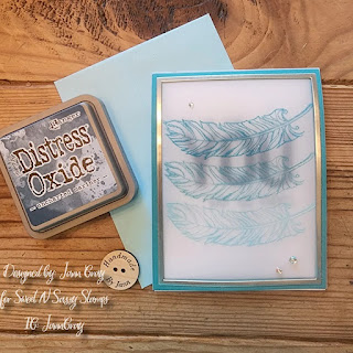
This first tutorial is about visual weight. Several of you have asked for a tutorial on creating stamping collages - like I have posted the last few days. I created all of these cards "Thanks" card, "Vintage Camera" card and "Sunflower Collage" card utilizing the concept of Visual Weight.
You can see in this picture that I recreated the the background collage first in just black (no attention paid to visual weight) and then with black a grey (using only intensity to create visual weight).
Here is the tutorial...
Let me know what you think! Have a great week!


Very good lesson. Thank you for your teaching. Tammy A.
ReplyDeleteVery instructive. Love how the card looks. Johanne L.
ReplyDeleteOff to look Jann, it might make me understand why I sometimes think some of my 'art' doesn't look right but can't see why!!
ReplyDeleteHugs
Lynn xx
Thanks a bunch for a very useful explaination.
ReplyDelete